
I’m any good at designing UI now, it’s because I’ve analyzed stuff — not because I came out the chute with an intuitive understanding of beauty and balance.
Erik D. Kennedy, Independent UX/UI Designer.
The Rules
Here they are for the first part of our topic:
- Light comes from the sky
- Black and white first
- Double your whitespace
Rule 1: Light Comes From the Sky
Shadows are invaluable cues in telling the human brain what user interface elements we’re looking at.
This is perhaps the most important non-obvious thing to learn about UI design: light comes from the sky. Light comes from the sky so frequently and consistently that for it to come from below actually looks freaky.
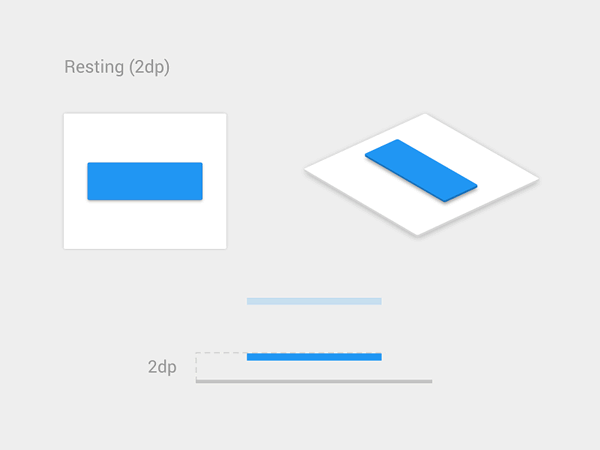
When light comes from the sky, it illuminates the tops of things and casts shadows below them. The tops of stuff are lighter, the bottoms are darker:
With buttons, there are still a handful of light-related details:
- The unpushed button (top) has a dark bottom edge. Sun don’t shine there, son.
- The unpushed button is slightly brighter at the top than at the bottom. This is because it imitates a slightly curved surface.
- The unpushed button casts a subtle shadow– perhaps easier to see in the magnified section.
- The pushed button, while still darker at the bottom than at the top, is overall darker– this is because it’s at the plane of the screen and the sun can’t hit it as easily.
That was just a button, and yet there are these 4 little light effects present. That’s the lesson here. Now we just apply it to everything.
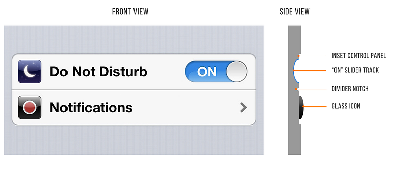
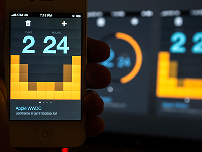
A pair of iOS 6 settings— “Do Not Disturb” and “Notifications”
iOS 6 is a little outdated, but it makes a good case study in light behavior:
- The top lip of the inset control panel casts a small shadow
- The “ON” slider track is also immediately set in a bit
- The “ON” slider track is concave and the bottom reflects more light
- The icons are set out a bit. See the bright border around the top of them? This represents a surface perpendicular to the light source, hence receiving a lot of light, hence bouncing a lot of light into your eyes.
- The divider notch is shadowed where angled away from the sun and vice versa
What about flat design?
iOS7 made a stir in the tech community for its “flat design”. No simulated protrusions or indentations— just lines and shapes of solid color.
We love clean and simple as much as the next guy, but I we suggest it is a long-term trend here.
More likely, we’ll see semi-flat UI in the near future. “Flatty design” – still clean, still simple, but you’ll have some shadows and cues for what to tap/slide/click.
Rule 2: Black and White First
Designing in grayscale before adding color simplifies the most complex element of visual design– and forces you to focus on spacing and laying out elements.
UX designers are really into designing “mobile-first” these days. That means you think about how pages and interactions work on a phone before imagining them on your monitor.
That sort of constraint is great. It clarifies thinking. You start with the harder problem – usable app on a teeny-weeny screen, then adopt the solution to the easier problem – usable app on a large screen.
Well here’s another similar constraint: design black and white first. Start with the harder problem of making the app beautiful and usable in every way, but without the aid of color. Add color last, and even then, only with purpose.
Designs that have a strong specific attitude need a designer who can use color extremely well.
But most apps don’t have a specific attitude except clean and simple design. Those that do are admittedly much harder to design:
 Responsive website design by Webcreator Studio |
 Flashy designs by Julien Renvoye |
Step 2: How to add color
The simplest color to add is one color.

Adding one color to a grayscale site draws the eye simply and effectively.

By modifying the saturation and brightness of a single hue, you can generate multiple colors— darks, lights, backgrounds, accents, eye-catchers— but it’s not overwhelming on the eye.
Using multiple colors from one or two base hues is the most reliable way to accentuate and neutralize elements without making the design messy.
A few other notes on color
Color is the most complicated area of visual design. And while a lot of stuff on color is obtuse and not practical for finishing the design in front of you, I’ve seen some really good stuff out there.
A small toolbox:
- Learn UI Design. Shameless plug: this is a course I’ve created, and it contains 3 hours of video about designing with color (and 13+ hours on other topics in UI design). Check it out at learnui.design.
- Color in UI Design: A (Practical) Framework. If you liked this section, but want to hear more about color (as opposed to just black and white), this is your article. And guess who wrote it!
- Never Use Black (Ian Storm Taylor). Talks about how totally flat grays almost never appear in the real-world, and how saturating your shades of gray– especially your darker shades– adds a visual richness to your designs. Plus, saturated grays more closely mimic the real-world, which is its own virtue.
- Adobe Color CC. An awesome tool for finding, modifying, and creating color schemes.
- Dribbble search-by-color. Another awesome way to find what works with a particular color. Talk about practical. If you already have one color decided, come look at what the world’s best designers are doing/matching with that color.
Rule 3: Double your whitespace
To make UI that looks designed, add a lot of breathing room.
In Rule 2, I said that B&WF forces designers to think about spacing and layout before considering color, and how that’s a good thing. Well, it’s time we talk about spacing and layout.
If you’ve coded HTML from scratch, you’re probably familiar with the way HTML is, by default, laid out on the page.
Whitespace, HTML, and CSS
- If you, like me, are used to formatting with CSS, where the default is no whitespace, it’s time to untrain yourself of those bad habits. Start thinking of whitespace as the default— everything starts as whitespace, until you take it away by adding a page element.
- Starting with a blank page means starting with nothing but whitespace. You think of margins and spacing right from the very beginning. Everything you draw is a conscious whitespace-removing decision.
- Starting with a bunch of unstyled HTML means starting with content. Spacing is the afterthought. It has to be explicitly stated.
In conclusion:
- Put space between your lines.
- Put space between your elements.
- Put space between your groups of elements.
- Analyze what works.
Based on https://medium.com/@erikdkennedy/7-rules-for-creating-gorgeous-ui-part-1-559d4e805cda