

Your logo is what people associate with your brand and what allows them to recognize and remember who you are.
Check out the following tips that will not only help you choose and create a logo design, but a memorable logo design:
1: Your Message
What does your brand represent? Are you serious or perhaps a little bit more relaxed and casual? Does your brand have a masculine feel or a feminine feel?
Logo is an essential part of brand identification, and as such, it can be quite difficult to find the design that’s just right for your company. You want to make it visually appealing, but how can you do that if you know that you’re also supposed to keep it simple?

Perhaps it’s inclusive or perhaps it caters to a specific niche. Whatever it is that your brand represents, it’s vital that you’re aware of your company’s message and are making sure that your logo accurately represents it.
2: Simplicity Sells
As a marketing expert, you already know that your logo should be simple, right? But what exactly does “simple” mean?
Logo design isn`t the time to show off your fancy design skills.

Successful logos steer clear from using complex gradients or meshes, so save your complex ideas and illustrations for something else. Remember, it’s more that just getting noticed, you need to be remembered.
Keep your logo relevant. Don’t try to cram your logo with everything that your company provides. Keeping your design focused on the main aspect of your company will help maintain a simpler design.
3: Color
It’s important to remember that color not only subconsciously triggers reactions within a person, but that it is also perceived differently depending on the individual. This is why it is absolutely essential to know how you want to be perceived as a brand. Knowing so is what allows you to cater to the preferences of your target audience.
![]()

For example, colors like green and blue emote a sense of calmness, whereas warmer colors like red or orange make more of a bold or confident statement.
*TIP: Be cautious about the number of colors you use. A general design tip for logos is to not exceed 2-3 colors.
4: Typography
Just like color, different fonts emit different vibes, and as a digital marketer, you need to really understand what your brand represents and choose your fonts accordingly.
![]()
For instance, a sans-serif font with many round edges and looping letters gives across more of a fun, playful vibe, and would probably not be suited for a medical practice or a law firm. The right font will give your audience a good idea of your brand’s message, so make sure to choose carefully.
5: Context
When designing professional logo, keep in mind that it’s not going to live on your screen forever.
Picture it in a brochure, in the top corner of a web page, or on a billboard; does it still look good?
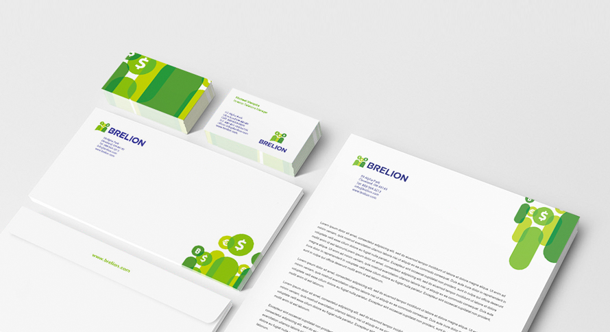
Scalability and adaptability to different backgrounds are things you need to consider as well. Complex designs aren’t ideal for scaling up or down, which is why it is imperative that your design remain simple.