
An interface animation shows interactions between screens, explains how to use the application or simply directs a user’s attention.
In this article some basic principles & rules will be collected in one place.
Functional ANIMATION
- Optimize perceived user experience, make it feel faster and more comprehensive
- Drive users’ attention
- Provide visual feedback and prepare for next steps
Functional animation is crucial to suggesting interaction as well as understanding the system states.
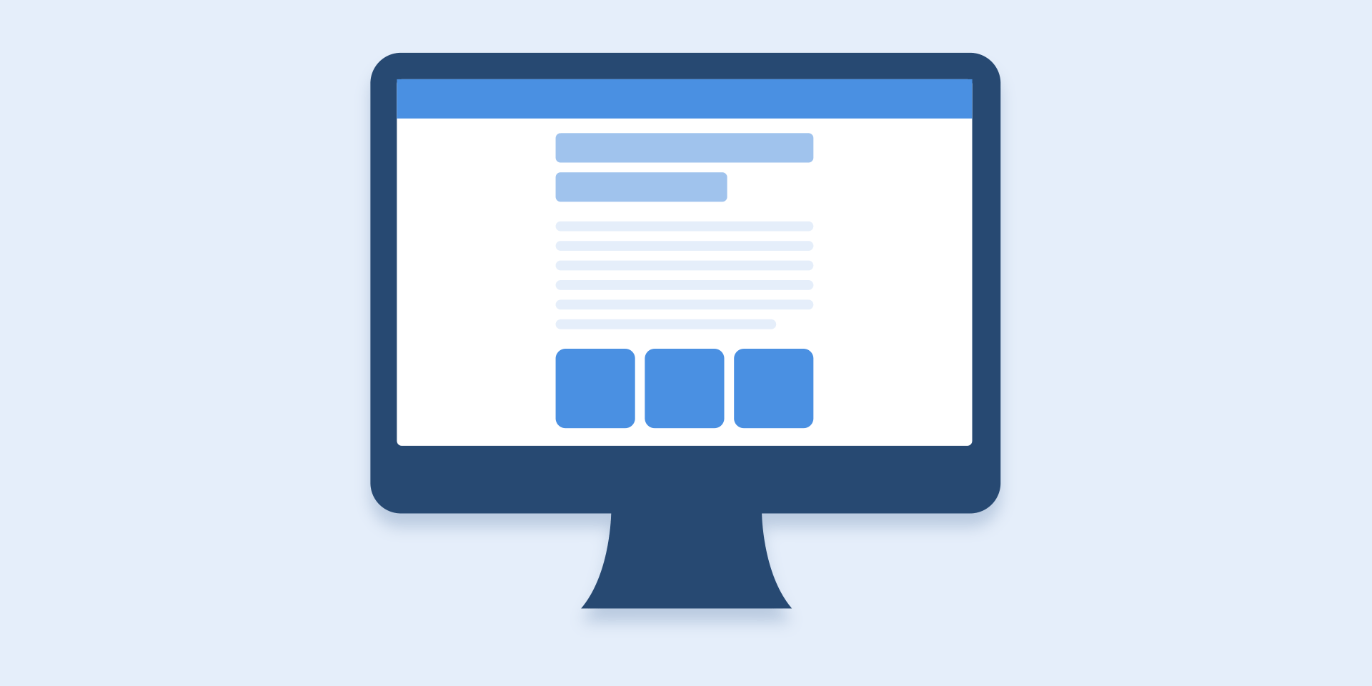
State changes in UI, especially on the web, often involve hard cuts by default, which can make them difficult to follow. In cognitive science this is called change blindness — when sudden change in visual stimulus prevents users from noticing new information.
DURATION AND SPEED OF THE ANIMATION
When elements change their state or position, the duration of the animation should be slow enough to give users the possibility to notice the change, but at the same time quick enough not to cause waiting.
Proper duration in animation.
Numerous researches have discovered that optimal speed for interface animation is between 200 and 500 ms. These figures are based on the particular qualities of the human brain. Any animation shorter than 100 ms is instantaneous and won’t be recognized at all. Whereas the animation longer than 1 second would convey a sense of delay and thus be boring for the user.
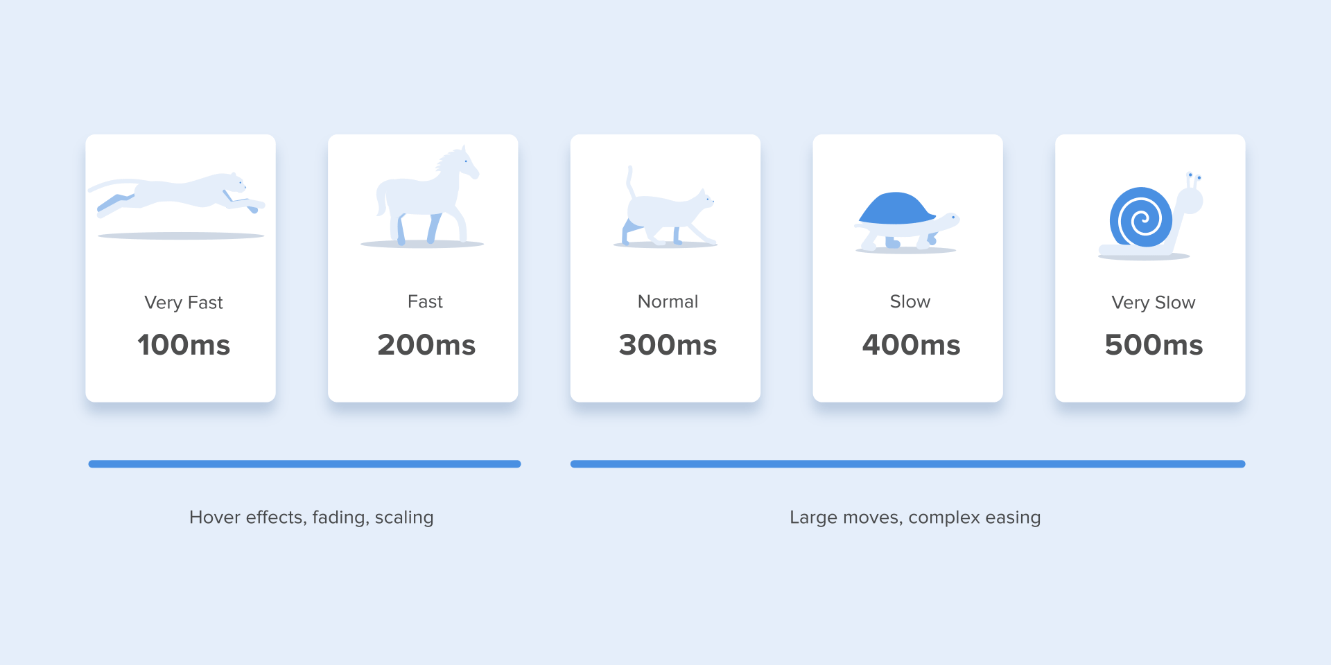
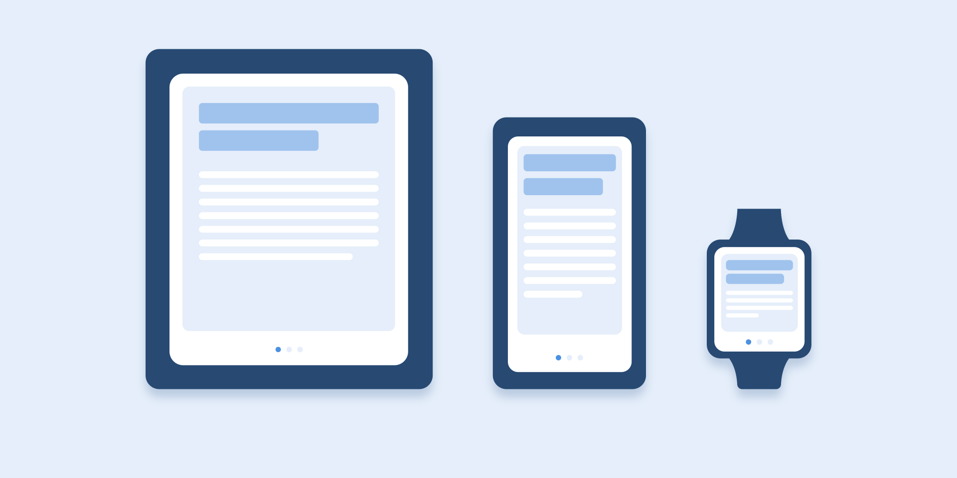
As for tablets, the duration should be longer by 30% — around 400–450 ms. The reason is simple: the size of the screen is bigger so objects overcome the longer path when they change position. On wearables, the duration should be accordingly 30% shorter — around 150–200 ms, because on a smaller screen the distance to travel is shorter.
Web animation is treated in a different way. Since we are accustomed to an almost instant opening of web-pages in a browser, we expect to transit between different states quickly as well.
So, the duration of web transitions should last about 2 times shorter than on mobile devices — between 150–200 ms. In other cases, the user will inevitably think that the computer freezes or has troubles with the internet connection.
But. Forget about these rules if you are creating a decorative animation on your website or trying to attract the user’s attention to certain elements. In these cases, animation can be longer.
You need to remember that regardless of the platform the duration of the animation should depend not only on the traveled distance but also on the size of the object. Smaller elements or animation with small changes should move faster. Accordingly, the animation with large and complex elements looks better when it lasts a little longer.
Among the moving objects of the same size, the first one to stop is the object that has passed the shortest distance.
Small objects in comparison with large objects are moving slower since they make bigger offsets.
MAKE THE CONTENT IN TABS SLIDE
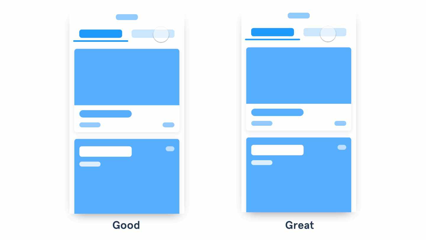
- A good animation fades the content in and out from one state to another.
- A great animation shows continuity in a transition by making the content move between states.
Similarly, in UI, we want to tell a great interactive story on tiny screens. Our characters are UX flows, our fictional universe consists of UI controls. And we don’t have two hours — we’ve got merely seconds before a user is confused and loses attention.
create a perfect animation using basic tips
Whether you are developing an app or working on a business presentation — you might want to spice things up with some animations.
- Animations can help you create a flow, they can create progress, emphasize or soften changes, catch the eye, and cause delight.
- Animations are great, but you need to know how to use them, otherwise they are just annoying.
This guide will try to explain some principles to create simple animations that never fails.
Rule #1: Do not throw in childish animations
I’ve seen too many dumb animations being used by good speakers.
Dumb animations are easy to recognise: they do not have a consistent direction, they do not contribute to the flow of the presentation (or app) and usually we (the audience or the users) just want them to end.
Rule #2: Select a simple movement direction and stick with it
Select a direction to your software animation (or slides transitions) and stick with it for the entire show.
Here’s an example of 3 elements flying in from the bottom of the screen.
This is a classic animation that can be used in presentations or in your app (i.e. a toast flying in from the bottom of the screen with a short status update).
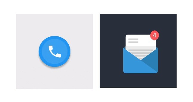
RULE #3: Bring attention to something important
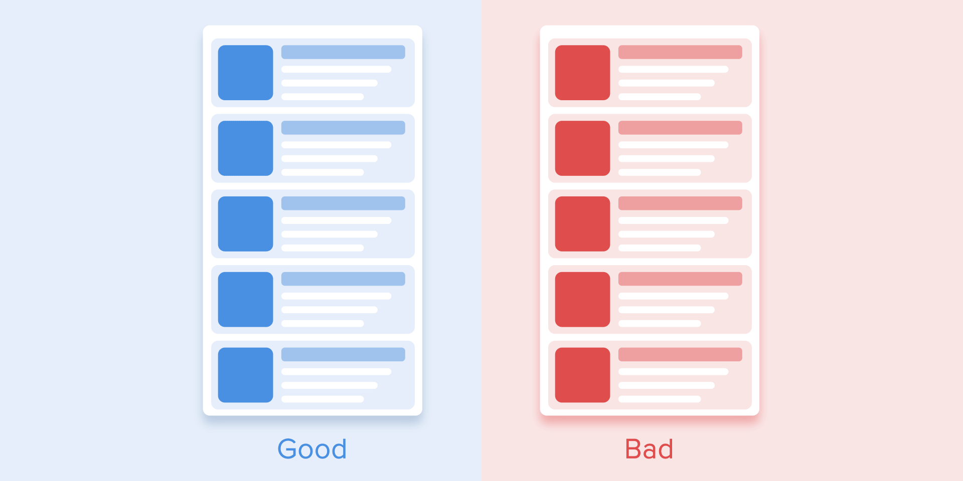
The example on the left uses color and position to make an element stand out. The one on the right uses a subtle animation to call the user’s attention.
- Good design uses color, size, and position to highlight an important action the user needs to notice or act upon.
- Great design uses animation to bring attention to that important action, without being disruptive.
When the user needs to act on something important, try animating the actions to attract their attention.
Photos provided by Motion Design, Behance
This type of functional animation can also be used to attract a user’s attention to important status changes in an app, or even in a system, such as an incoming call.
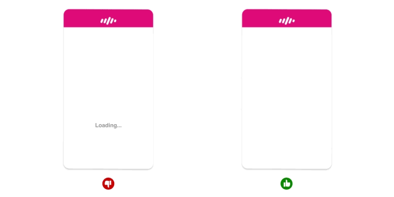
Start with a subtle animation and increase the intensity (change of size, color, and speed) in relation to how important the action is. For example, animated loading bars shows how fast a process goes and sets an expectation for how fast the action will be processed.
Rule #4: Combining tiny delays and slow ending — the winning formula
Combine the smooth ending with the short delay between elements.
The first element slows down (ease out) while the second and third elements are still moving in and it creates an interesting and natural motion.
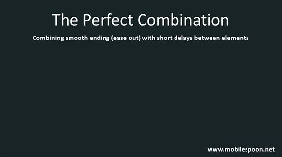
And even though the movement itself seems simple — the result is stunning.
RULE #5: Animation must not waste time
Animation can be used to tweak the user’s perception of time, so use this in your favour. For the human brain, anything below 0.1 seconds will seem instantaneous and below 1 second will seem seamless. So, if you have a process that takes 6 seconds for instance, you can break it down in a few separate animations. This trick should make the process feel a lot faster and keep your user engaged.
If there’s only one principle of UI/UX animation you care about it should definitely be timing. It is one of the most important considerations when designing transitions. The animation should be quick and precise, with little or no lag time between the user’s initiating action and the beginning of the animation.
Functional animation helps the eye see where a new object comes from upon its reveal and where a hidden object goes . It provides visual cues, making the interaction easier to follow and reinforcing what has occurred.
Purposes:
- Define the spatial relationship between screens and elements.
- Avoid a surprising transition by helping users comprehend the change that has just happened in the page’s layout.
User interface should quickly respond to user input precisely where the user triggers it and show the connection between new surfaces and the element or action that creates them. It feels great to click through the app and always feel like you know what’s happening.
Based on:
1. https://blog.prototypr.io/6-animation-guidelines-for-ux-design-74c90eb5e47a
2. https://www.webdesignerdepot.com/2017/07/5-unbreakable-rules-for-ui-animation-on-the-web/
3. https://www.smashingmagazine.com/2017/01/how-functional-animation-helps-improve-user-experience/
4. https://uxplanet.org/functional-animation-in-ux-design-what-makes-a-good-transition-d6e7b4344e5e