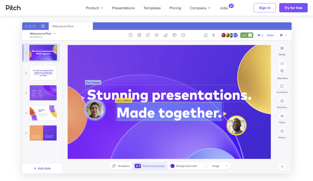
1. Pitch

2. Drift
Drift has effectively reflected the ethos of their brand. Drift is all about creating “personalised conversations”, which is even demonstrated in the use of a font that looks handwritten. This is a great unique addition.
3. Zendesk
They use a friendly tone with phrases like “champions of customer service” and “take Zendesk for a spin” to create an easy-going and inviting feel. Large font effectively draws attention to these moments.
4. Mailchimp
Narrowed their target audience to small businesses by copy like “Mailchimp helps small businesses do big things”. Colors, style and clear CTA.
5.Stripe
Stripe credits itself as being a high-tech company, which is reflected in their web design choice of brightly coloured moving graphics that automatically draw users in.
Their copy is centred around customers building belief in Stripe. A key way they do this is by using strong social proof with phrases like “millions of businesses” use Stripe’s software.
6. Slack
Slack offers an informative video that showcases their platform, leveraging the 88% more time users spend on pages with video.
7. Typeform
The minimal layout, explanation video and neutral palette make the website both easy to navigate and aesthetically pleasing.
This website continues to excel with a social proof section of examples of how they have helped grow individual businesses — the testimonial of Mask Match is particularly smart as it’s so current.
8. VideoAsk
Face-to-face video plays on mute when you land on the site, almost unconsciously urging a user to turn the sound up. A potential client then gets an immediate taster of the product.
The team member in the video also asks the viewer a direct question, giving a real sense of interaction and communication — the aim of the product.
9. TransferWise
TransferWise prides themselves on being transparent about their fees and their website does that straight off the bat. Right at the top of their homepage, they have a graphic that walks users through every fee and every step taken in the conversion process.
10. Fullstory
FullStory overtly displays business metrics on their website as a sales pitch with a link to a new study at the top of their homepage — “enterprise retailer sees 411% ROI using FullStory”. This is a great way to lead with your best foot using numbers.