
A conversion rate optimization (CRO) strategy is a way of optimizing each stage of your marketing funnel. By looking at each stage of your funnel on an individual basis, you may start to see holes where leads or revenue may be leaking through.
1. Useful and clear demo video of your product or service
It is a must. Just think out like newbie person who visits your site firstly. You have to very quickly demonstrate what your product does. And the best way to do it is short video.
Is a great step towards convincing your visitors that you sell quality products. Watching the benefits and functionality of your tool highlighted in the video is highly useful as it equips the customers with knowledge. This knowledge will help them know that they are getting a product that fulfills their needs.
Just check out demo of Slack to get inspiration.
Also, think about a video presenting a glimpse of the manufacturing process of your goods. People enjoy behind-the-scenes kind of video because it makes them happy to know what goes into their favorite products.
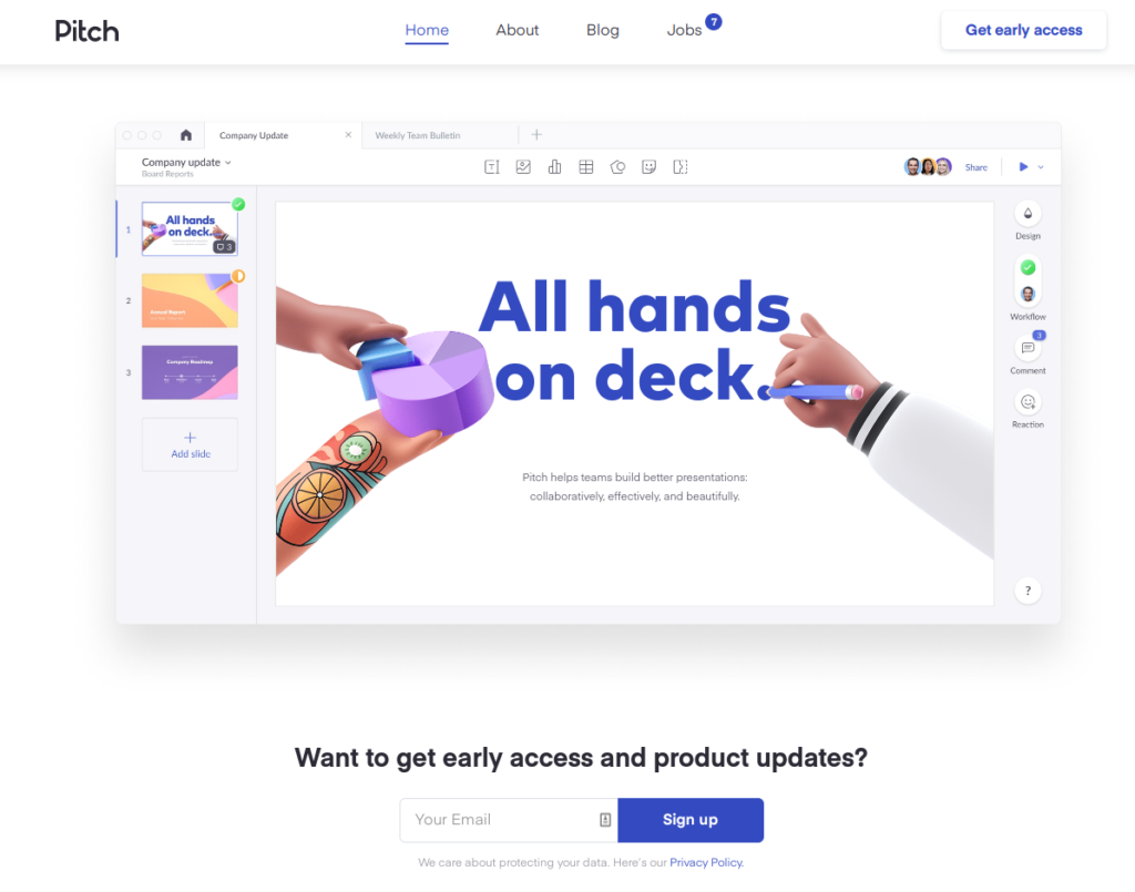
2. Home page = Product Page
If you have one product design Home page as main product page with comprehensive landing. So visitors have all they need to know to be just one step away from converting to customers without long study.
To increase the chances of conversions, you need to be sure that images for each product should be original and of the highest quality. Try taking pictures from various angles and lighting effects; in short, avoid anything that might cause them to surprise when they receive the actual product.
Here’s 2020 fresh example of effective lading page of Pitch software.
3. Use design to point customers towards your CTA
Do your customers a favor by holding their hand and telling them exactly what you want them to do. Don’t assume that your intentions will be obvious when a customer hits your landing page. A SaaS landing page should be set up in such a way that users have no choice but to eventually follow your CTA.
You can use directional cues, such as an image of a person whose gaze is directed at your CTA button. Aptrinsic could have improved the design of their homepage using this technique to make it more conversion-friendly.
Aptrinsic would do well to swap the image to the other side of the copy and CTA button, since users naturally look from left to right. The man’s gaze would then be looking toward the button, encouraging users to click.
Eye gaze and line emphasis are just two types of directional cues that create a path for the user to follow.
4. Encourage buyers to rate your products
Customer ratings can basically be helpful for the new visitors on your website. It creates a positive feeling about your website and goods you sell. Also, asking for the reviews will make your current customers feel valued and part of your business. Posting new reviews is a great way to keep your site look fresh, and giving a boost to your reputation. (source: www.amazon.com)
5. Quick effortless checkout
Try do not ask your customers to fill a long list of details that is not required and avoid to make them type the same information again. It just brings in the risk of typos and adds fussiness to the process.
According to a research, one of the most common reasons for customer abandonment is compulsory site registration. Keep the registration optional, and allow them to checkout as a guest if they do not want to register. Simultaneously, point out the benefits of registration like order tracking, or better customer support.
Based on
www.convertize.com/how-to-improve-your-saas-conversion-rate/