
 
We asked the members of optimizers community how e-commerce websites can increase their conversion rates and run better A/B and multivariate tests.
The post will share tips sourced directly from optimizers about how to best optimize your e-commerce experience across every device, taking into account both conversion best practices and design principles:
1. Use artwork to make an emotional connection with new visitors on the homepage
Creative imagery is a powerful tool for making an emotional connection with your visitors.
Artwork is often most impactful at the top of the funnel when you are aiming to make an emotional connection with users. As users advance through the funnel and move out of the discovery mindset and shift to become more task-oriented, images can become superfluous and distracting.
We 2. Experiment with the best email capture methods
Many e-commerce websites are testing out popup modals, or lightboxes, that ask a visitor to share their email address, often in exchange for an initial discount. But remember, if your email sign-up modal is the first point of interaction visitors have with your website, you may find that the vast majority of your visitors dismiss and ignore it.

We recommend minimizing the friction that you introduce to the user experience when asking for information. Consider targeting pop-ups only to return visitors because intuition for new users will be to close a pop-up without even reading it.
Allow your visitors to interact with some of your website content so their purpose for navigating to the site is at least somewhat fulfilled before requesting personal information.
3. Test a value proposition adjacent to the product page CTA
We If you offer free shipping for larger order or a money-back guarantee, value propositions like these are a key way to differentiate your e-commerce experience beyond the products you sell.
When you have the ability to offer a unique experience, make sure your customer knows about it. It is recommended to test key value propositions like “Free Shipping” or “Easy Returns”, featuring them as close to the primary CTA as possible.
4. Keep shoppers focused with a prominent breadcrumb
Shoppers move from exploratory to task-oriented as they progress through your e-commerce website.
The product page is a key middle ground where shoppers are exploring their options, but will need to focus their decision-making attention before they add their product to a cart and move on to checkout.
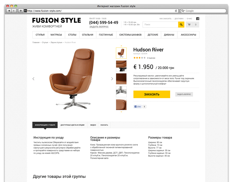 
Webcreator uses detailed breadcrumb on the product pages of furniture store to make it easier for shoppers to navigate within categories of products as they shop.
One device for keeping shoppers focused is a site breadcrumb on all product pages. The breadcrumb gives users guidance on how to explore a set of products they’ve already shown interest in.
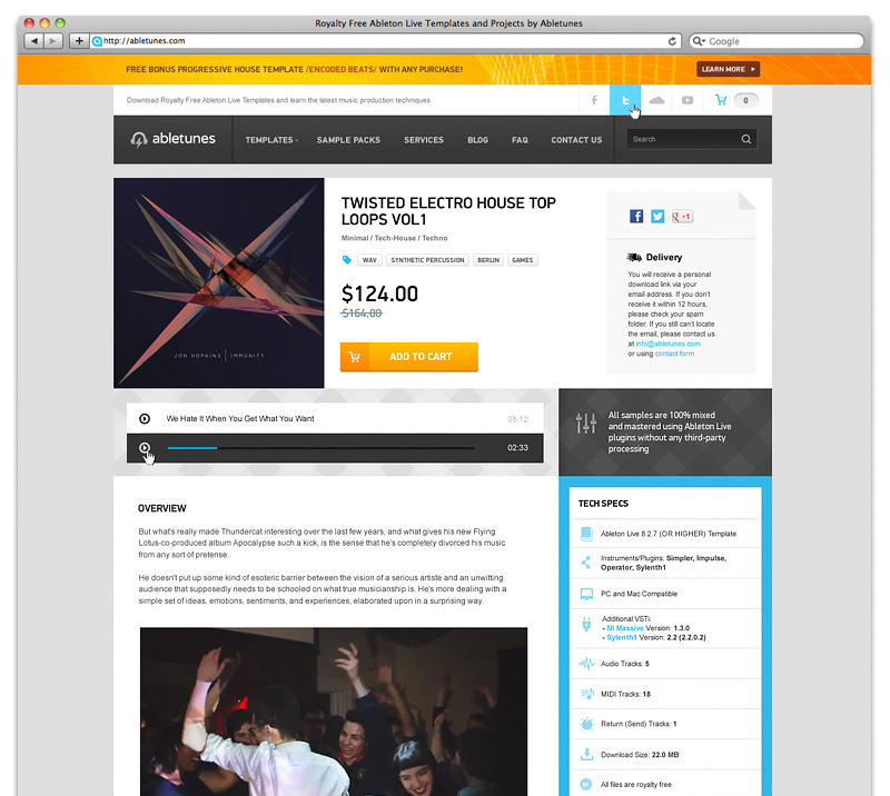
5. Confirm when shoppers add a product to their cart
For example, show visitors a preview of their cart instantly once they add an item, and features a checkout CTA prominently.
http://www.webcreator.ws/en/portfolio/smartland_siteShowing a preview of the current cart alongside a checkout call to action reduces the effort required to take the next step and begin the checkout process.
We 6. Prioritize your A/B tests wisely
There are dozens of factors to A/B test in order to influence your conversion rate and generate more value from your digital user experience.

When prioritizing test ideas, our team considers the importance of the page(s) that will be impacted. One thing we struggle with in regard to that discussion is whether tests on the homepage, for example, are more or less important than tests in the checkout funnel because it receives so much more traffic and, if designed well, could capture the attention of new visitors.
Traffic, or the volume of visitors to your site, is a finite resource that can dramatically influence how your plan to A/B test, and should be factored into the prioritization process for organizing experiments.
7. Don’t just redesign; iterate and test
“Redesign” is a word that carries enormous weight, loaded with both optimism for a better user experience and increased conversions, as well as a tremendous investment of resources. Should you test small changes, or a completely redesigned experience?

When the objective is to test a completely revamped page, is it best to do so in an iterative process with one element changing at a time or all at once with the redesigned page as the one variation? We want to know which changes provide a positive/negative impact, but we also want to know how those elements work together as a whole.
Should be recommend iterative process over a complete redesign tested against the original, because it provides more insight about users’ behavior. A complete redesign will not tell you what about the redesign influenced a change in behavior.
8. Test when visitors need to register
An email address, as mentioned in best practice number 2, is key to extending the customer relationship beyond the time on your website or mobile app, be it through remarketing when a shopper abandons their cart or emailing a promotional offer to bring them back to your website.

Many e-commerce conversion optimizers are asking: when is the best time to require an email, like a sign-in form to purchase or to add a product to a cart? Mobile sites also pose some unique challenges because of screen size and users’ browse-not-buy tendencies on mobile.
A trend in e-commerce design is requesting the email address at multiple stages of the funnel, including at the end when a user has advanced to checkout. Email credentials are then requested to create an account instead of letting visitors complete a purchase as a guest.
9. Break up form fields on mobile
Conventional wisdom with forms can sometimes feel contradictory: reduce form fields to increase mobile conversions, or err on the site of showing visitors the entire process up front so they don’t drop off throughout the process? This is why testing the ideal experience for your visitors is essential.
The only way to uncover the perfect e-commerce design experience for your visitors is to iterate and test. Bring user feedback and expert best practices into your brainstorming process, and make sure your hypotheses are grounded in data and design best practices. You’ll arrive at an improved experience for both your business goals and for your visitors. If you are not about this, please, contact us for professional help anytime.
https://blog.optimizely.com/2015/10/29/ecommerce-best-practices/