
Every day, people use online forms for basic life activities such as bookings or rent. That is why it is our goal as UI/UX and web design specialists to the process as easy as possible. Users should be able to complete them quickly and without confusion.
What Makes For An Effective Form
The primary goal with every form is completion. Two factors have a major impact on completion rate:
Perception of complexity
The first thing users do when they see a new form is estimate how much time is required to complete it. Users do this by scanning the form. Perception plays a crucial role in the process of estimation. The more complex a form looks, the more likely users will abandon the process.
Simplify your forms:
Interaction cost
Interaction cost is the sum of cognitive and physical efforts, that the users put into interacting with an interface to reach their goal.
The more effort users have to make to complete a form, the less usable the form is. A high interaction cost could be the result of data that is difficult to input, an inability to understand the meaning of some questions, or confusion about error messages.
The Components Of Forms
A typical form has the following five components:
- Input fields
These include text fields, password fields, checkboxes, radio buttons, sliders and any other fields designed for user input. - Field labels
These tell users what the corresponding input fields mean. - Structure
This includes the order of fields, the form’s appearance on the page, and the logical connections between different fields. - Action buttons
The form will have at least one call to action (the button that triggers data submission). - Feedback
Feedback notifies the user about the result of an operation. Feedback can be positive, indicating that the form was submitted successfully, or negative, saying something like, “The number you’ve entered is incorrect”.
This article covers many aspects related to structure, input fields, labels, action buttons and validation. Most points mentioned in this article have visual do and don’t examples, created using Adobe XD.
Input Fields
When it comes to form design, the most important thing a designer can do is to minimize the need for typing. Reducing input effort is essential. Designers can achieve this goal by focusing on form field design.
Minimize the total number of fields
Every field you ask users to fill out requires some effort.
Baymard Institute analyzed checkout forms and found that a too long or too complicated checkout process is one of the top reasons for abandonment during checkout.
The study found that the average checkout contains almost 15 form fields. Most online services could reduce the number of fields displayed by default by 20 to 60%.

Top reasons for abandonment during checkout. (Image: Baymard Institute)
Many designers are familiar with the “less is more” rule; still, they ask additional questions in an attempt to gather more data about their users. It might be tempting to collect more data about your users during the initial signup, but resist that temptation. Remember that, as long as you’ve collected a user’s contact information, you can always follow up with a request for more data.
CLEARLY DISTINGUISH ALL OPTIONAL FIELDS
Before optimizing optional fields, ask yourself whether you really need to include them in your form. Think about what information you really need, not what you want. Ideally, the number of optional fields in your form should be zero.
If after a brainstorming session, you still want to include a few optional questions in your form, make it clear for users that those fields are optional:
- Mark optional fields instead of mandatory ones.
If you ask as little as possible, then the vast majority of fields in your form will be mandatory. Therefore, mark only those fields in the minority. For instance, if five out of six fields are mandatory, then it makes sense to mark only one field as optional. - Use the “Optional” label to denote optional fields.
Avoid using the asterisk (*) to mean “optional.” Not all users will associate the asterisk with optional information, and some users will be confused by the meaning (an asterisk is often used to denote mandatory fields).

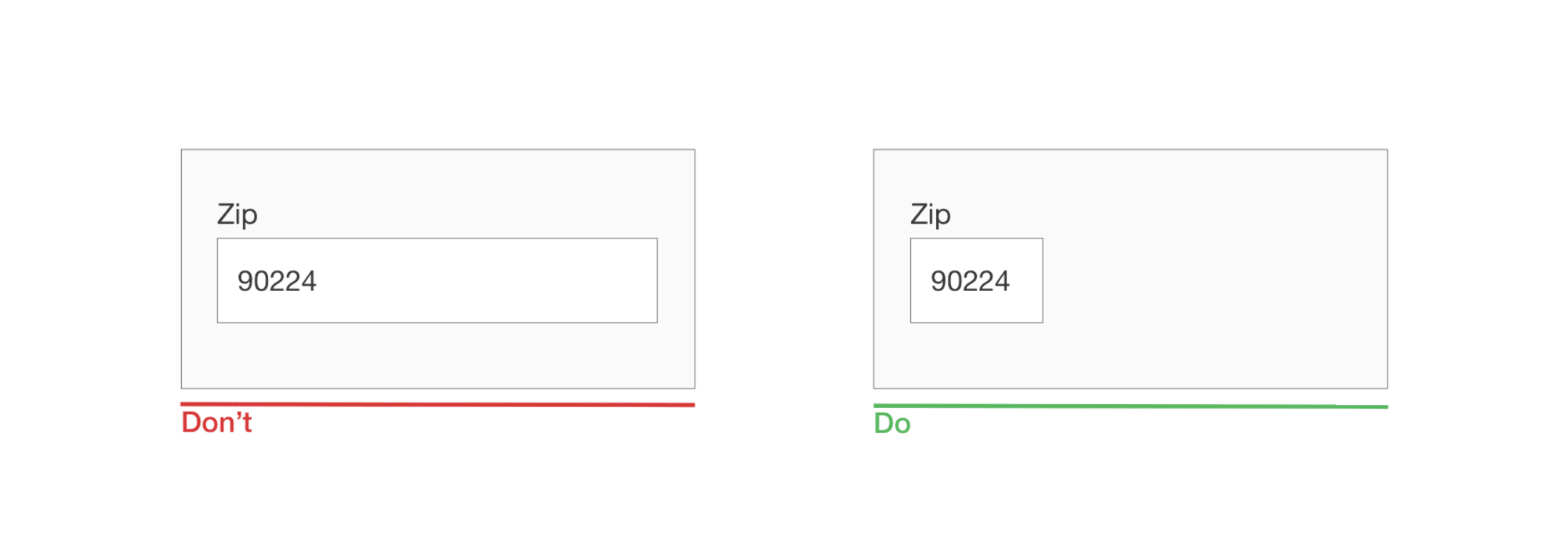
SIZE FIELDS ACCORDINGLY
When possible, use field length as an affordance. The length of an input field should be in proportion to the amount of information expected in the field. The size of the field will act as a visual constraint — the user will know how much text is expected to be entered just by looking at the field. Generally, fields such as ones for area codes and house numbers should be shorter than ones for street addresses.
DON’T ASK USERS TO REPEAT THEIR EMAIL ADDRESS
The reason why an extra field for the email address is so popular among product developers is apparent: Every company wants to minimize the risk of hard bounces (non-deliverables caused by invalid email addresses). Unfortunately, following this approach doesn’t guarantee that you’ll get a valid address. Users often copy and paste their address from one field to another.
PROVIDE “SHOW PASSWORD” OPTION
Instead of duplicating the password field, provide an option that allows users to view the password they have chosen to create. Have an icon or checkbox that unmasks the password when clicked. A password preview can be an opportunity for users to check their data before sending.
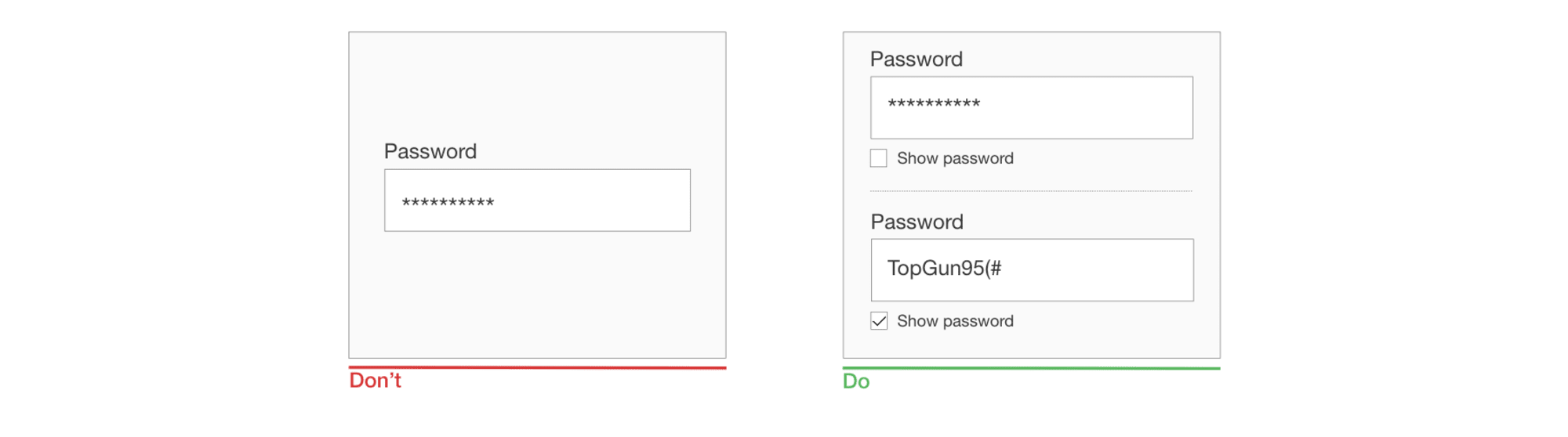
Duplicating the password input field is another common mistake among product designers. In reality, a second field for a password doesn’t guarantee that users will proceed without mistakes. Because users don’t see what they’ve entered in the field, they can make the same mistake twice (in both fields) .
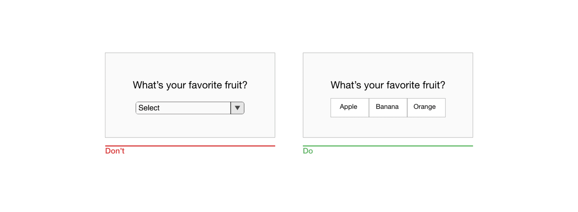
AVOID DROPDOWN MENUS
If you’re using a dropdown for selection of options, consider replacing it with radio buttons. They will make all options glanceable and also reduce the interaction cost — users can tap on the item and select at once.
Placeholder Text
The text in an input field can tell users what content is expected. Placeholder text is not required for simple fields such as “Full name”, but it can be extremely valuable for fields that require data in a specific format.
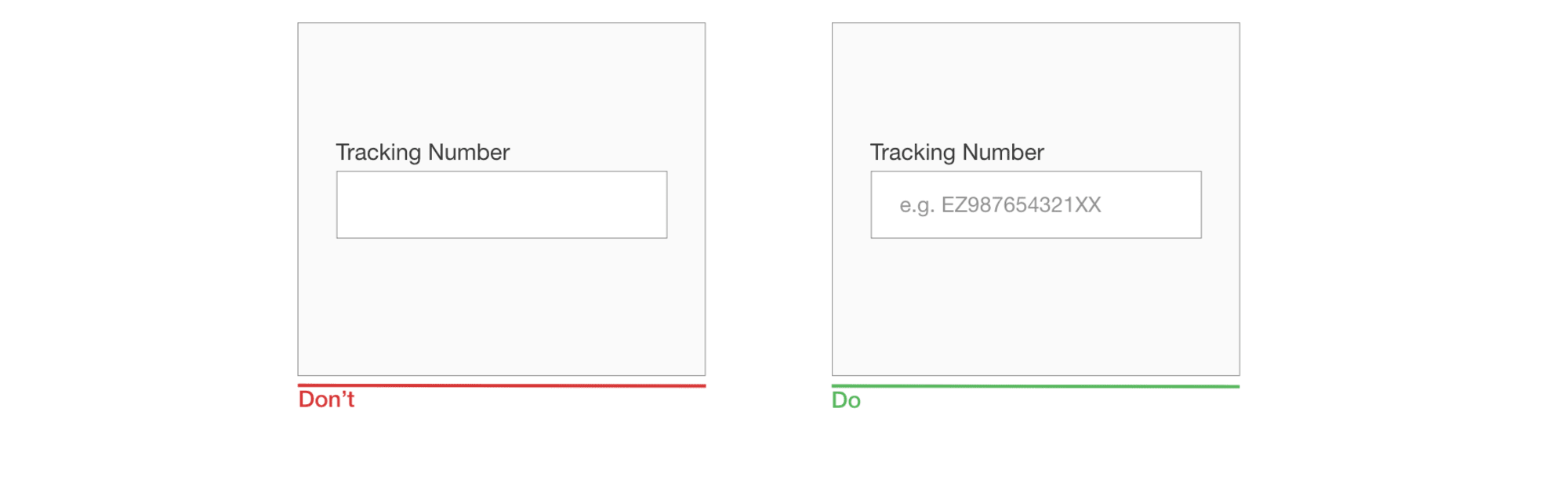
Masked Input
Unlike placeholders, which are basically static text, masks automatically format the data provided by the user. Masked input also makes it easy for users to validate information.

Use a Slider When Asking For a Specific Range
Instead of using two separate fields, “from” and “to”, for that purpose, use a slider to allow users to specify the range with a thumb interaction.
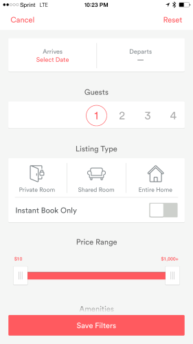
AirBnB dual continuous slider for a price range
Field Labels
WRITE CLEAR AND CONCISE LABELS
The label is the text that tells users what data is expected from them in a particular input field. Writing clear labels is one of the best ways to make a form more accessible. Labels should help the user understand what information is required at a glance.
Avoid using complete sentences to explain. A label is not help text. Write succinct and crisp labels (a word or two), so that users can quickly scan your form.
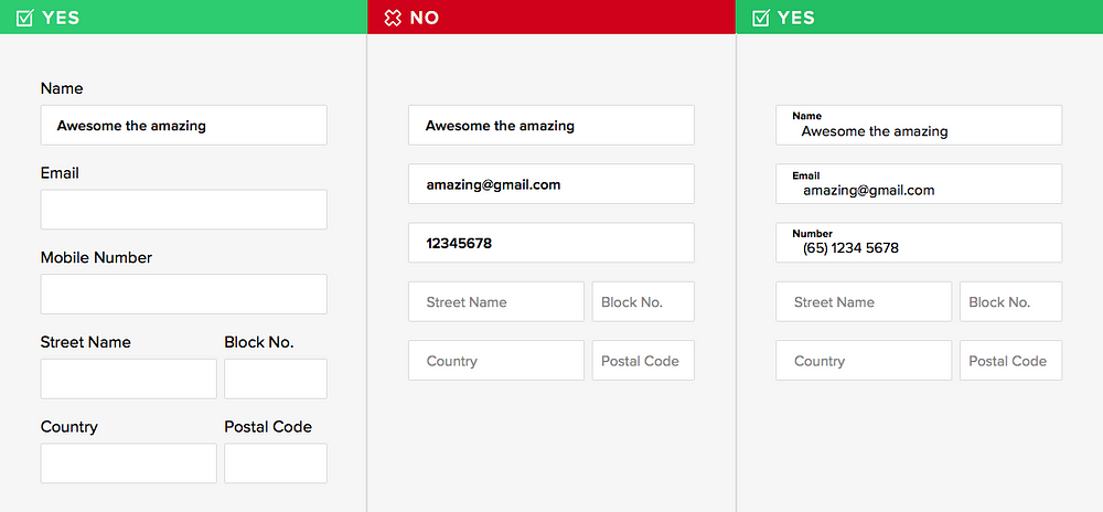
Form fields should be easily recognizable
PLACE THE LABEL AND INPUT CLOSE TOGETHER
Put each label close to the input field, because the eye will visually know they’re tied together.
A label and its field should be visually grouped, so that users can understand which label belongs to which field.
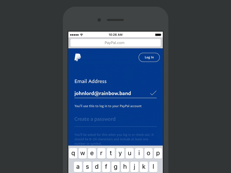
PayPal is a fantastic example of mobile form design. As a company which relies so heavily on the filling in of forms as the primary function of the app, it is especially important that they are easy and fast to fill in.
Large fields are easy to tap on and fill in. The type is large and contrasting against the dark blue background. As well as this, PayPal has introduced a scroll effect which ensures the current form element is always in the primary viewing area.
DON’T USE DISAPPEARING PLACEHOLDER TEXT AS LABELS
While inline labels look good and save valuable screen estate, these benefits are far outweighed by the significant usability drawbacks, the most critical of which is the loss of context. When users start entering text in a field, the placeholder text disappears and forces people to recall this information. While it might not be a problem for simple two-field forms, it could be a big deal for forms that have a lot of fields (say, 7 to 10). It would be tough for users to recall all field labels after inputting data. Not surprisingly, user testing continually shows that placeholders in form fields often hurt usability more than help.
Don’t use placeholder text that disappears when the user interacts with the field
When users start entering text in a field, the placeholder text disappears and forces people to recall this information. While it might not be a problem for simple two-field forms, it could be a big deal for forms that have a lot of fields.
There’s a simple solution to the problem of disappearing placeholders: the floating abel. After the user taps on the field with the label placeholder, the label doesn’t disappear, it moves up to the top of the field and makes room for the user to enter their data. Floating labels assure the user that they’ve filled out the fields correctly.
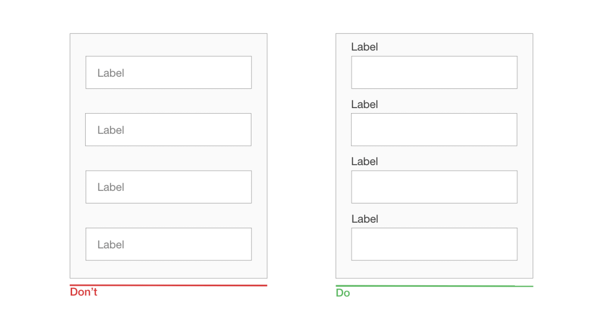
TOP-ALIGN LABELS
Putting field labels above the fields in a form improves the way users scan the form. Using eye-tracking technology for this, Google showed that users need fewer fixations, less fixation time and fewer saccades before submitting a form.
Another important advantage of top-aligned labels is that they provide more space for labels. Long labels and localized versions will fit more easily in the layout. The latter is especially suitable for small mobile screens. You can have form fields extend the full width of the screen, making them large enough to display the user’s entire input.
Based on https://www.smashingmagazine.com/2018/08/best-practices-for-mobile-form-design/