
At the prototyping stage of different products we often say: “Let’s cut out all these unnecessary things, does the user really need all of them?”. Will users take the same actions with them as we predict?
All prototypes are reviewed two or more times in order to cut out any unnecessary elements.
Not all designers think like users
Normally users aren’t bothered that your interface has deep meaning. You have right layers, organization, right shadows, some elements come from the right, some from the left. They don’t care.
Here is an example. We were discussing some animations in one of our apps, regarding layers and navigation. One of the opinions was: “The user knows which layer they came from, and they understand that this additional screen will come from the right side”, but this not the case – they don’t care which side the screen comes from! If it comes from the left, then it must leave to the left. And that’s all. There are two fundamental points: the user likes and uses an app, or they don’t.
Does it look nice and work well for UI/UX design?
Here is one more case. We were making a remote control for one of our products and there was an icon on the button composed of 4 squares, It means that the user can go to the content catalogue. For about half a year I couldn’t get it out of my head that this icon was the Microsoft logo. When I decided to solve this problem, I understood, that the user may not know or care about it at all. But this icon is the most suitable one for this case.

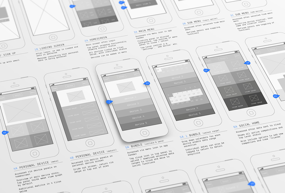
MVP prototyping
There is no end for the product. Every product can be improved lots of times, it can continually get better and better by adding different features and so on. While you are creating a product, there is such a notion as MVP – Minimum Viable Product. It is a product which has just enough features to gather validating learning about the customer and its continued development.
Even when we make prototypes for mvp, we try to make them with as many features as we can, and then we cut from all sides anything that users won’t need, to make the product simplier and easier. We think a lot about different buttons and we try to make less screens so the user can achieve their goal faster.
If you doubt your prototype, look at it from different sides, check all user stories, cut all unnecessary things and try to think like the user.
Context
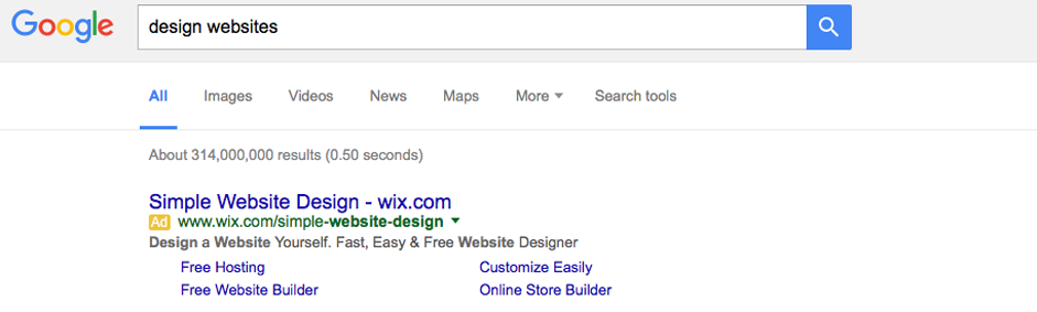
Do users need all the information that is on the screen? This is a popular question for those companies who care about their product and their users. Yandex shows a good example of context. Yandex, first of all, is a technological company, so they try and show the great possibilities of their technology. In this case we are talking about searching. Regarding statistics, users rarely go beyond two pages of search results – basically they don’t care about the quantity of results. Many people don’t need this information. Yandex shows this result in the search input, but it’s very light and not intrusive.
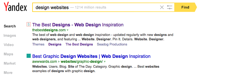
Google offers the user the same information but it is more readable and they add the time in which the request has been processed. In this case, the Yandex search UI fits “design for people”.
Don’t try to show the user information that is useless or obvious. If you are making an online TV app and your potential user goes to recorded tv shows, then chooses an episode for a past date, there is no need to scream about it in video player. They know that they chose this old episode by themselves, you can give a small mention about it.
Animation’s Place in Web Design
Animation is considered decorative by most web development professionals. Viewing animation as something just “nice” makes it much more difficult for this stage of the process to be taken seriously, when in fact it is an essential part of the process of communication and understanding of an interactive project.
We use HTML to tell stories and communicate large amounts of information, animation helps us do both things, better. Imagine animation as a tour guide which allows people to track the history of your site without getting lost. It helps people to orientate themselves within the interface, to find their way or establish visual relationships.
Interface animation fills gaps of comprehension in various ways:
- It is crucial to suggest interaction and creates a visual stimulus so the user perceives new information in a status change in the interface
- It provides visual feedback and guides to what is coming next
- It presents spatially logical transitions between screens. According to the laws of physics animated elements can help people memorize interfaces more easily because they seem familiar and predictable
- Animation styles communicate more personality to the content than any static image
- Well produced animations win over users, help them relate better to the product and make a more pleasant and enjoyable experience
Conclusion
Try to learn as many statistics of different apps as you can. Watch how people use their smartphones on the street, in transport, create pools in social networks and so on. All these things will help you to create one of the best user experiences.
Based on: www.awwwards.com/cut-it-and-other-tips-for-ux-design.html