
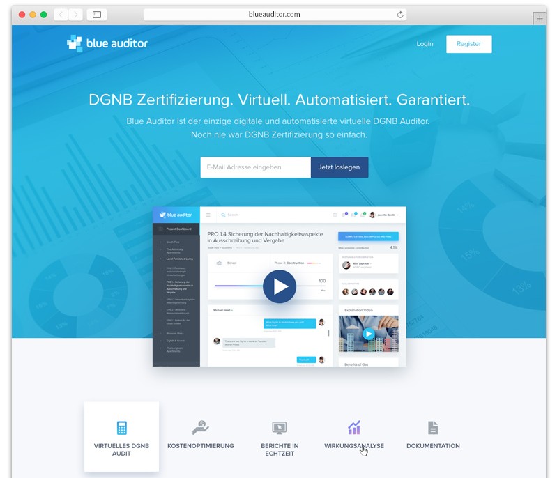
The optimization of the different landing page zones answers the question “how to increase the conversion rate of your landing page” and turns visitors into sales or leads.
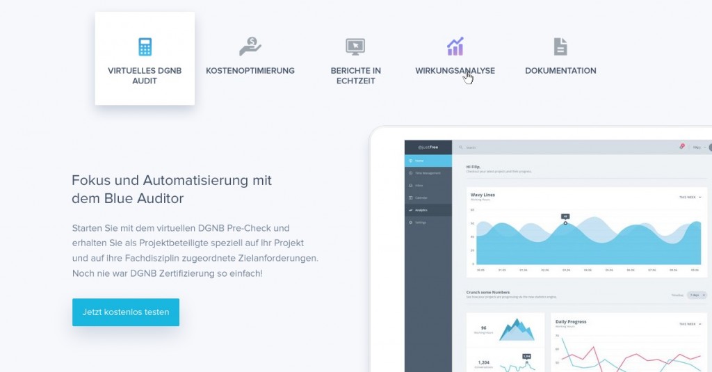
Landing page zones
The contents of a website can be portrayed as a department store.
- The entrance or first visible area is the Hero Zone. This is about attention and excitement.
- In the second zone, the Comfort Zone , it is superficially about efficient usability through simple and agile navigation.
- It gets sexy in the Information Zone , which keeps users on the site through qualitative content and warms them up for the conversion.
- The action zone ultimately serves the sales or lead generation and completes the overall picture.

Schematic representation of the website zones
# 1 entry the Hero Zone perfectly – webpage footer
So-called Hero Images draw the full attention of the user and pick him up ideally right at the beginning. These images should be at the visual level of the user’s search intent and animate to scroll.
Considering the PageSpeed and proper SEO images , only high-resolution images should be used, the central elements of the page category, landing page can play.
Discreetly placed call-to-action elements, such as label buttons, can already achieve a few micro conversions in combination with crisp teasers. It is immensely important to ensure an elegant start and convince the user at the
In particular, B2C online shops can score points by placing Hero Images, for example, in combination with special offers or image series of new products. As succinct as it sounds, the first few seconds can decide.
# 2 The common thread is the comfort zone
Search engines like Google have long understood how users move around the pages, what is seen and what is clicked. It is no longer up to date for each keyword to create landing pages and link them in the menu and thus inflate it.
If a user has landed on the page to his query, everything should be made to keep it on the pages. Through an intuitive slim user interface and, for example, a faceted navigation for better filtering.
Especially for B2C online shops, it can be advantageous to display large product images in a clear web design and not overload the category pages unnecessarily with product boxes.
In Informational B2B websites internal jump buttons or link boxes can ideally complement conventional navigation.
Schematic representation of a supplementary navigation of a B2B website
Especially on mobile devices, it is crucial to provide a fast and clear navigation to keep users in the comfort zone. In the web design trend, a side slide menu is currently proving successful.
# 3 Sexy Content in the Information Zone of your webpage
SEO text deserts are increasingly forgotten in times of qualitative content. Because qualitative content is not only a guarantee for good rankings , but also for satisfied and buying users. Storytelling is announced and rich information about products and services arouse interest and increase the time spent on the sites. To drive more SEO traffic to conversion, content must provide answers to search queries, encourage interaction, and make the user fun on any device.
The following onpage content requirements should be met:
- Content should be created for people, not for search engines !
- The focus on high-search keywords should shift to favoring more-conversational long-tail keywords with fewer search volumes
- Content should be informative and non-sales driven
- Content should not be too short but not too long
- Content should remain consistent throughout the page in style and style
- Consuming content should be fun for the user
# 4 Eye-catching candies in the Action Zone
Visual effects and animated call-to-action elements have been in high demand in the days of Flash. With new technology such as HTML5 and modern CSS buttons can irritate by micro animations to click.
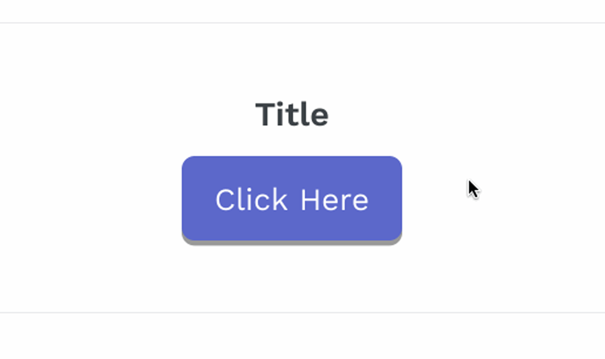 Call-to-action animation
Animations and exciting interactive elements not only increase awareness but increase the likelihood of prolonged retention and the lure of what’s behind it. Ideal for preparing a lead or sale through a micro conversion.
# 5 Personalization on the landing page
Personalization is one of the key levers in Conversion Optimization, because the greater the supply (products or services) that fit the needs of the user, the greater the chance of conversion.
The well-known online shop Zalando, for example, uses a gender-based homepage. When visiting the shop for the first time, the gender of the user is stored based on the product selection. In another call, he lands later automatically in his department.
The personalizations are theoretically no limits. The most common ones include:
- Content personalization
- Automated personalized product recommendations
- Personalized behavioral pop-ups
- Personalized trigger-based emails
- Personalized product arrangement
In particular, the behavior-based pop-ups and trigger-based e-mail (eg after leaving the website) work very well to attract the visitor at the last second still as a customer.
Conclusion: The Best Methods for After-Rank Sales & Leads
Achieving traffic through good rankings is the first step to a sale or lead. Once arrived on the website, it is now to convince and turn interest in a purchase. Design elements create attention and build up the tension of the user. Through an agile and structured navigation and web page structure not only confidence is awakened, but at the same time a logical self-contained information hierarchy and logic are conveyed.
First-class content and visual aesthetic animations guide the flow of users and make surfing fun. The longer the stay persists, the better the user can react through personalized actions and finally achieve a conversion.