
This is the post in a series on designing a purposeful user flow, which is an intentional, directed flow of information and choices designed into your website’s most important positioning content that does not rely upon a visitor exploring and using a navigation menu.
Tell Them How You Do It
An company’s landing page exists to explain a purpose in more detail than a short positioning statement and then to direct a slightly more-informed prospect to learn more about the ways an agency fulfills that purpose. Those ways are your services.
Your services might be truly discrete, meaning I could hire you for one or more of them individually, but may not necessarily need what all have to offer. Or, your services might be discrete disciplines, but necessarily connected to one another, meaning that they require different processes and personnel, but when I hire you, I go through them all; I cannot buy them ad hoc. Either way — whether it is completely standalone or a piece of a larger sequence — each of your services should have a dedicated landing page designed to explain what they are, how they work, and what they achieve.
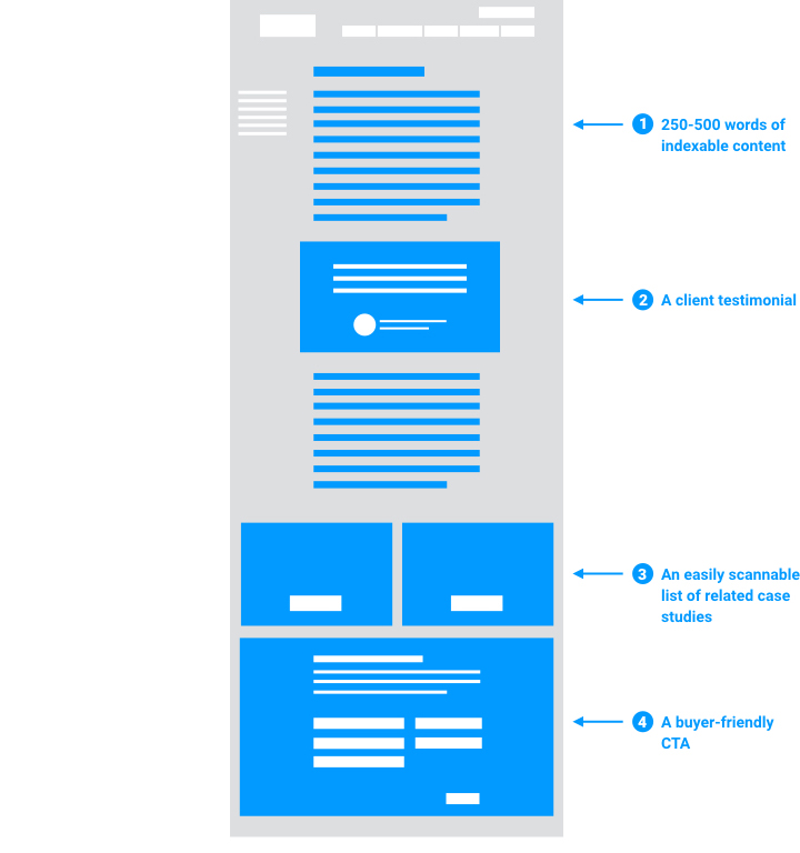
Those goals are achieved by a service landing page that has the following four attributes:
- ~250-500 words of indexable content
- A client testimonial (social proof)
- An easily scannable list of related case studies
- Buyer-friendly call to action
Most of these attributes are self-explanatory, but let me briefly elaborate on each one.
Be brief
This page needs to explain what makes an individual service unique, a little bit about how it works, and nudge the visitor toward envisioning some outcomes. On that latter point, that nudge will come in the form of your related testimonial and case studies. But as for explaining what makes this service unique and how it works, make sure you tell a prospect everything they need to know in order to make a decision to either buy or learn more, but not everything they’d need to know in order to do it themselves. This page is a pitch, not a manual.
Social proof:
As I’ve said before, a happy client will always be a better salesperson than you. Try to feature a testimonial here that speaks to the full scope of what your firm offers and the transformation you’ve made possible for them.
Now give them your proof
The goal of this page is to direct an even more informed visitor toward the content that proves the value of your services. After your brief description of this service, list a few case studies in a way that is easily scannable. Stick to a name, a brief abstract, and a clear button that directs them to another page dedicated to the case study alone. Navigating to a case study detail page is the most important choice you want a visitor to make on this page.
A buyer-friendly call-to-action is one that invites a prospect to get in touch with you directly to discuss working together.

Though the most important step you want to design in to this page is the one that takes a prospect even deeper into the site, to a page dedicated to telling the story of how you applied this service to a real-world problem, if a visitor is ready to go, don’t block their way.
Make it clear that they can “get started” or “request a meeting” at any point along the way in your purposeful user flow.
That is the purpose of the service landing page — to best use the attention it receives by explaining how a service fulfills your firm’s mission and directing visitors to learn more about the application of that service in the form of a case study.
So, in my next post, I will wrap up this series on purposeful user flows and share the best practices for an agency case study.