Great web design is an art, and it has become ever more important to ensure that your decisions are focused on an accessible user experience.
The principles of universal design arose from a recognition of the need to overcome obstacles to accessibility, particularly in the case of individuals with physical or cognitive difficulties.
There are a few fundamental tenets to use to make design better and transform the customer journey into an accessible and enjoyable digital experience.
1. Provide Choice
Customize your content in the manner that suits clients best to enable engaging user experience.
Providing users with options for how they would prefer the website/app/SaaS to function for them is a strong first step towards a universal design strategy.
The ability to control certain elements of their interactions with your brand gives customers a sense of agency, which helps them to feel more secure and familiar with your brand.
This, in turn, can increase the chances that they will share content, sign up for services, or purchase products. For e-commerce, this is a particularly important part of the business’ conversion strategy and the long-term success of the brand.
2. Automate Key Features
A great UX is one that predicts the user’s needs and proactively adapts to provide the best possible experience.
To accomplish this, it is helpful to include automated functions within your app and website that streamline consumer interaction and intuitively customize their experience of your brand.

You have to impress your visitors at every stage of the flow. It’s called the user experience in ecommerce.
Put your direct customer service phone number in an easily findable place. And you can also consider chatbots or chat solutions.
3. UX of checkout flow
The most controversial question.
But if you understand your customers and eCommerce UX well, you don’t need to worry.
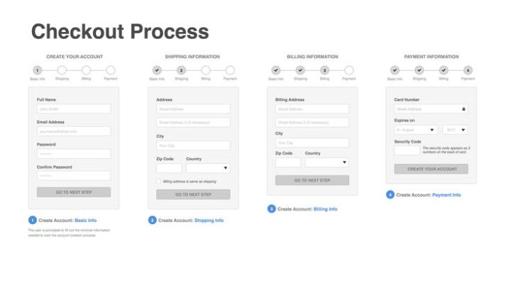
Smashing magazine put together the 12 most important tips for the best checkout flows:
- Don’t force users to register for shopping
- Inform the availability of the product
- Allow your customers to easily modify their orders
- Provide real-time support
- Keep the back button fully functional
- Provide photos, specifications, and links for the items in the basket
- Provide progress indicator
- Keep the checkout interface simple
- Don’t take the user out of the checkout process
- Inform the users about the delivery conditions and times
- Tell the customers what’s next
- Send out a confirmation email
Here is a good example for a checkout flow based on the list above:
 Have you put your members’ faces to your ecommerce site? You should. People will engage more when they realize that there are “real” people behind your logo.
4. Building trust in ecommerce UX
One of the most time-consuming tasks in the relation between UX and ecommerce is trust building.
This post will give you some basic tips that you have to take into account when designing an ecommerce site.
The first one is having a strong mission. When you communicate your mission to your customers they are going to understand the value of your products.
You should consider using testimonials and product reviews on your site. Many people make decisions based on others’ opinions. Amazon does this perfectly.
5. Embrace Responsive Design
A user could be accessing content from any of a wide range of devices. It is essential for content to display correctly across all formats and devices.
Responsive design uses a combination of style sheets, fluid grids, and flexible images to make adjustments according to the detected screen size without having to realign UI and UX for each platform.
6. Implement Color Theory
Colors significantly impact the readability of text on your web pages. This is important for users with a form of color blindness.
Choose text and background colors carefully, considering not only the visual appeal of those colors but how well they contrast.
A poorly chosen color scheme can make navigation difficult, and may quickly deter potential customers, so it is vital to make the right choices when considering this aspect of design.
7. Test Everything
Usability lies at the heart of UX best practices. Knowing the site’s users and their specific needs will provide the knowledge needed to make design decisions that minimize or eliminate barriers to engagement with site content.
Research and testing is the key to knowing and understanding these user needs. Methods such as split-testing allow for the comparison of two design iterations, while usability testing can highlight problem areas of the design.
Refer to the Web Accessibility Initiative’s guidelines for a handy checklist of features to consider when designing for universal usability.
As with every aspect of UX design and digital marketing, understanding your audience is essential.
Planning for an experience that is accessible to every customer can benefit a business without compromising on the style, tone, or message of the brand.
Based on:


