
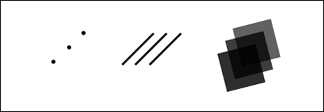
VISUAL GRAMMAR
Our role as designers is to simplify as much as possible, aiding usability in the process. The best interfaces remove as much as possible, removing complexity in the process.
Building UI components, focus on re-using elements and minimizing visual complexity. With a core set of simplified and elegant components built, focus on combining these to create understandable interfaces that ease user interactions.
Language And Typography Link
With a deep understanding of visual grammar mastered, it’s important to consider the underlying fabric of what we design, which is – more often than not – language, given form through typography. Working hand-in-hand, both are incredibly important and are supplemented by other forms of content: illustrations, photography, and video, for example.
Language – the words we choose to communicate – matters, and it’s important we give it thought as designers. When embarking upon any new project it’s important to start by defining the language that underpins your design, it will shape your users’ perceptions. Ask yourself: What’s the message? Then find the right words to communicate that message.
Whether you’re working with external clients as a consultant, internal project stakeholders as an in-house designer, or building a digital product, language matters. Before embarking on any new project set aside some time to spend with your stakeholders to help them define their message.
You can follow a systematic process designed to clearly define clients’ core message:
- Who are you?
As an individual or a business. - What are your values?
- What’s your mission and purpose?
- What do you hope to achieve?
- How will we know if you’re successful?
With the answers to these questions defined, it’s important to start to define the language that will underpin the project. The language that you choose shapes your design and needs to be considered from the perspective of both macrocopy and microcopy.
At a macro level, words can help set a tone and voice, as well as establish and reinforce the personality of a brand.
At a micro level, words can satisfy a functional requirement by aiding and improving design interactions.
At both levels – macro and micro – words can, when used in a considered manner as a part of the design process (indeed as another, core design element), aid and improve the user experience leaving users delighted and happy.
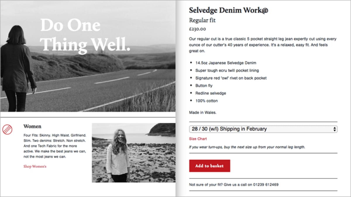
Look at picture above. Hiut Denim’s macrocopy (left) tells the story of the brand: ‘Do One Thing Well,’ ‘We make the best jeans we can.’ The company’s microcopy (right) is focused on helping the user satisfy a goal – buy the right pair of jeans – whilst still communicating the brand: ‘Our regular cut is a true classic.’, ‘If you wear turn-ups, buy the next size up.’
One way of defining macrocopy is to develop a ‘brand dictionary’: a palette of words that defines the brand you’re working on. This helps to ensure that the words you use throughout a project are: clear, concise and consistent, reducing confusion.
With your macrocopy defined it’s important to focus on functional microcopy: the words you use to ease interactions. Microcopy should reflect your brand’s values but is more likely to be consistent from one project to another. Everyone understands what ‘Add to basket’ means, so don’t confuse your users by inventing your own terminology.
As Robert Bringhurst (the author of The Elements of Typographic Style, widely accepted as the ‘bible’ of typography) states: “Typography is the craft of endowing human language with a durable visual form.” Put another way typography is clothing for words. Just as we can dress smartly or dress down, so too, the typographic choices we make fundamentally change how our users interpret the language we’ve crafted.
When our medium is largely focused on language, it stands to reason that an understanding of typography is critical. As Oliver Reichenstein, of digital product studio iA, puts it:
[When] 95% of the information on the web is written language, it is only logical to say that a web designer should get good training in the main discipline of shaping written information, in other words: typography.
Just as we consider language at the macro and micro level, so too, we need to consider typography in a similar manner. Type needs to be designed at: the macro, page-level, considering the overall structure of the page and the typographic hierarchy; and at the micro text-level, considering the details, including leading and spacing.
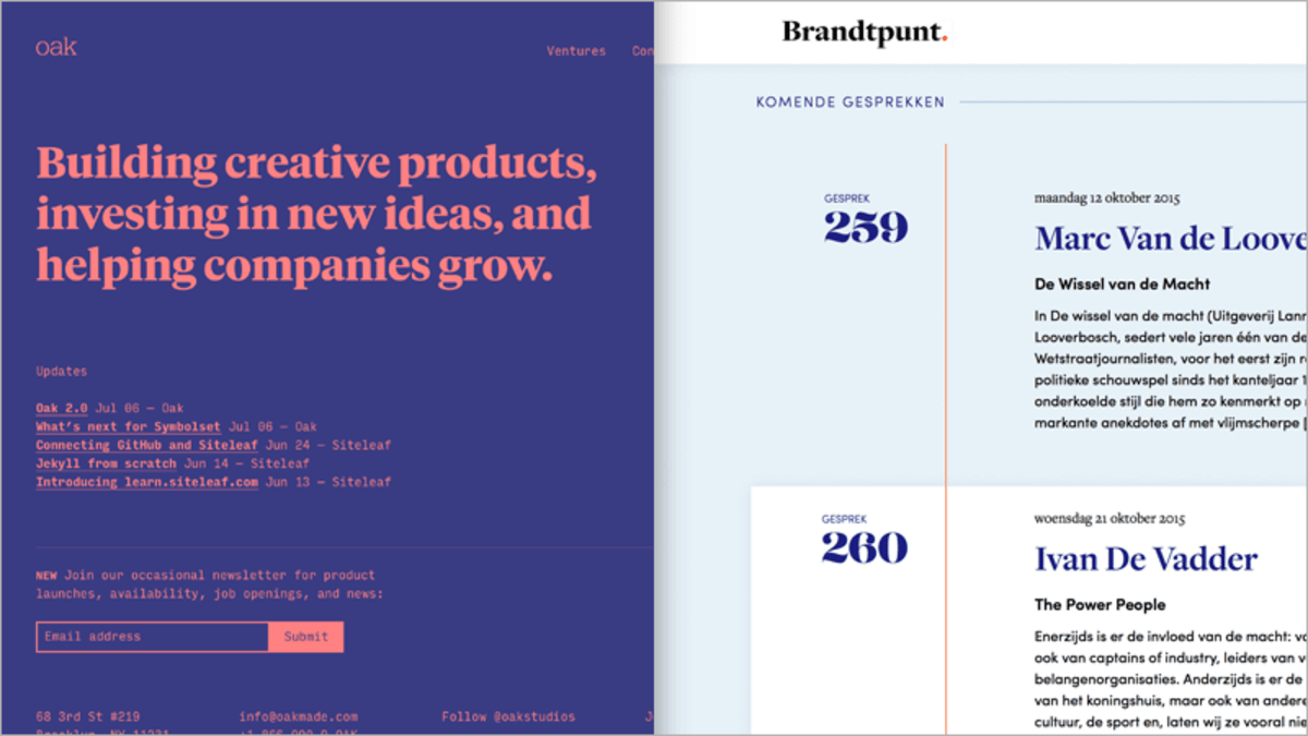
The Oak Studios website (left) demonstrates a clear typographic hierarchy, using scale – and a simple, two color palette – to guide the reader around the page; Brandtpunt focuses on typographic details, including bold issue numbers (259, 260…) to liven up the page.
Typography can, of course, be used for decorative effect, but – equally, and more importantly – it can be used to improve UX. With your language clearly defined it’s important to consider how typography can be used to:
- Optimize legibility, through the appropriate choices of typefaces;
- Improve accessibility, by considering contrast between the foreground and background colors; and
- Improve usability, through a considered typographic hierarchy.
There are a wealth of other typographic resources on- and offline.
CASE STUDIES: LANGUAGE AND TYPOGRAPHY
When used hand-in-hand, language and typography can deliver more than the sum of their parts, enhancing the user experience. It’s critical to consider both as integral parts of the web design process.
In an ideal world, it would be preferable to employ the services of a content designer and a typographer to assist the team. Would that we all lived in that ideal world! In the real world, developing a sound understanding of language and typography will improve your design considerably.
There are many examples of content-driven websites we can learn from. If we break apart a couple, we’ll see how language and typography can be used to deliver memorable user experiences.
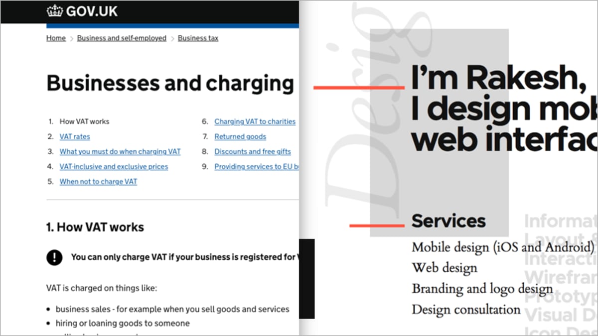
GOV.UK (left) showcases the power of well-chosen words; it’s a great example of a ‘language-first’ website; freelance digital product designer Rakesh Krishnan’s portfolio site (right) showcases the potential of well-chosen type.
GOV.UK is a great example of a website that is, first and foremost, language and content-focused. A winner of a coveted D&AD Black Pencil, the website has been celebrated for its stated intent to create a: “single domain for government.”
As designers, we can learn a great deal from GOV.UK’s approach, which emphasizes the importance of content design, a term – which it’s fair to say – the team at GOV.UK, led by Sarah Richards, helped to position front and centre.
The design, which follows the UK government design principles, is focused on:
- Starting with user needs, placing a heavy emphasis on identifying what those needs are and delivering them;
- Focusing on clear and consistent language, ensuring users become familiar with the services offered;
- Ensuring the site is as simple to use as possible
Just as important as the language we use are they choices of typefaces we make. Rakesh Krishnan’s portfolio site, Rakesh, is a lovely example of a site that combines a minimal color palette with strong, yet restrained typography. Its typography-focused approach offers lessons aplenty:
- Consider typographic pairings, a bold sans-serif typeface for headings catches the eye, coupling this with a classic serif for body copy helps aid legibility;
- A strong typographic hierarchy helps the reader find their way around the page;
- A contrasting bright red color accent offsets the largely monographic color palette adding a little brightness to the page.
When a considerable proportion of the information on the web is comprised of words, an understanding of language and typography is essential to improve user experience.
As designers, our role is to communicate as clearly as possible and to develop our understanding of these principles can enhance our designs considerably.
Narrative Design
A guide to the universal principles of user experience wouldn’t be complete without stressing the importance of narrative design. As designers, we are storytellers at heart, and we need to understand how stories work in order to tell them effectively. Above all as UX designers, we create experiences, and experiences unfold over time.
As UX designer, whether you’re creating experiences for desktop or mobile, web-based or native, – everything you create unfolds over a sequence of screens.
As designers, we need to consider pacing: deliver too much content too fast, and we’ll overwhelm our users; equally, deliver too little content too slowly, and we’ll send them to sleep. It’s important to focus on getting the balance right.
You might be building a single-page site or app, or a multi-page site or app; regardless you need to consider how your users move through your content and how it is paced.
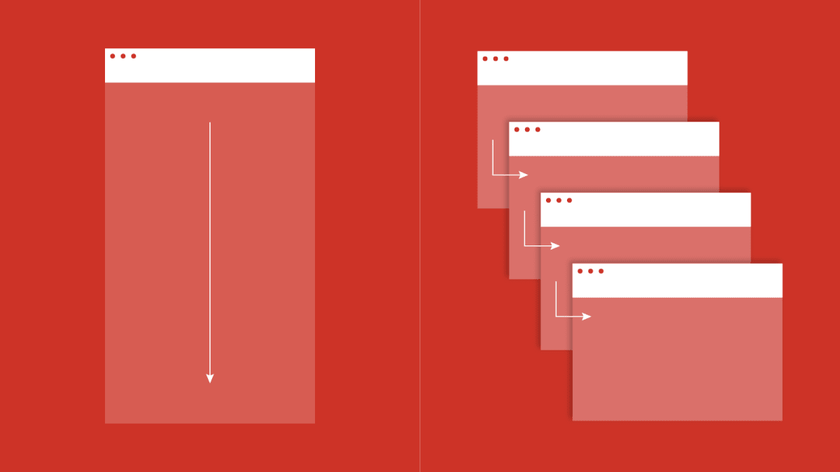
Your design might be a single-page narrative (left) or a multi-page narrative (right) — the choice will be determined by the content. Regardless, it’s important to consider the pacing of the elements on the screens and the relationship between the screens themselves.
Pacing is important, but equally, we need to consider the order in which we structure the content of our stories.
We’re living in a world in which information is expanding exponentially, and it can be incredibly hard to keep up. We have a responsibility to our users to deliver what they’re looking for as quickly as possible.
One technique we can use for this, drawn from the world of journalism, is the inverted pyramid. The inverted pyramid is a metaphor used by writers to illustrate how content should be prioritized and structured in text, for example in a newspaper article. Put simply: the inverted pyramid starts with the conclusion first, followed by information that supports that conclusion, followed by additional background details.
The core idea is that readers should be able to grasp the key messages being communicated, even if they don’t make it to the end of a piece of content. Each level down in the pyramid provides additional context, but the key point is delivered up front.
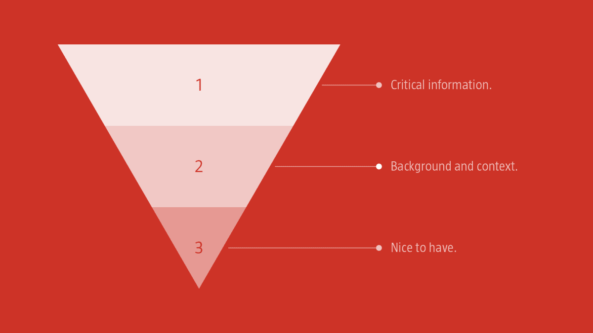
By applying the lessons of the inverted pyramid, drawn from the world of journalism, we ensure that our users are delivered information in the order they need it.
- Start with the information your users absolutely need and ensure this is right up front;
- Provide additional information that’s helpful, but not critical; and
- Close with the ‘nice to have’ information (for those readers who stuck with you until the bitter end!).
Like it or not we’re living in a time-pressured world.
As designers, we need to acknowledge that fact by ensuring the user experiences we design to reflect the need to get things done quickly and efficiently.
Great narrative designs are about a combination of the visual and the verbal; they marry the two to create well-paced stories that not only draw the reader in but captivate them on their journey through the content.
NARRATIVE DESIGN
With an understanding of visual grammar, and language and typography we have all the components we need to create compelling experiences. All we need now is a story to weave these elements around.
Stories are everywhere: we learn through stories, we’re entertained by stories, and – if we want to create great user experiences that draw an audience in – we should build our designs around stories.
There are a wealth of websites that are narrative-driven. If we break apart a couple – which you’ll need to visit and explore to truly get a feel for – we’ll see how pacing can be used to deliver truly memorable user experiences.
TIPS AND TECHNIQUEs
As you start to wireframe out a new project it’s important to consider the structure and the pacing of your narrative. Put some thought into how your content is structured and grouped logically. Paper prototyping is the quickest way to get a feel for a user’s flow through your narrative.
A low-cost medium, paper is perfect for getting the skeleton established before moving towards digital tools, developing lower and higher fidelity visual designs that can be tied together using a tool like Adobe XD.
Ask yourself: What’s the most important message that each page needs to communicate? With that established build your content so that it’s delivered efficiently. Remember, users are often time-poor and – for the most part – would like the critical content delivered quickly.
Everything is a story. When a hot dog site can create a colorful cast of characters to serve as an ensemble, ask yourself: What’s the story you’re telling in the project at hand?
In a world where everything is constantly changing, developing a deep understanding of visual grammar, language, and typography, and narrative design will last a lifetime.
This article is part of the UX design series sponsored by Adobe.